New Feature Spotlight: Create Consistent Brand Imagery with Background Composer
When backgrounds vary wildly across images, your site and social feed can look messy
Cionde Official
Updated November 25, 2025 - (4 min read)
You don’t need a studio or expensive software to make your photos look professional. With our new Background Composer, you can remove a photo’s background and apply a clean, brand‑ready backdrop in seconds. This gives your product pages, social posts, and ads a consistent, polished look that builds trust and helps sales. This article walks you through the feature, shows simple best practices, and gives a quick A/B test you can run today.
Why Consistent Backgrounds Matter
A photo’s background sets the tone. When backgrounds vary wildly across images, your site and social feed can look messy. Consistent backgrounds:
Improve perceived quality of your products.
Make pages look professional and trusted.
Help shoppers focus on the product, not a busy background.
Create a unified brand feel across channels.
If you sell online or post regularly, consistency is an easy win.
What the Background Composer Does (Simple)
The Background Composer is made for people who want great images fast:
Upload a photo (phone photos work).
The tool removes the original background automatically.
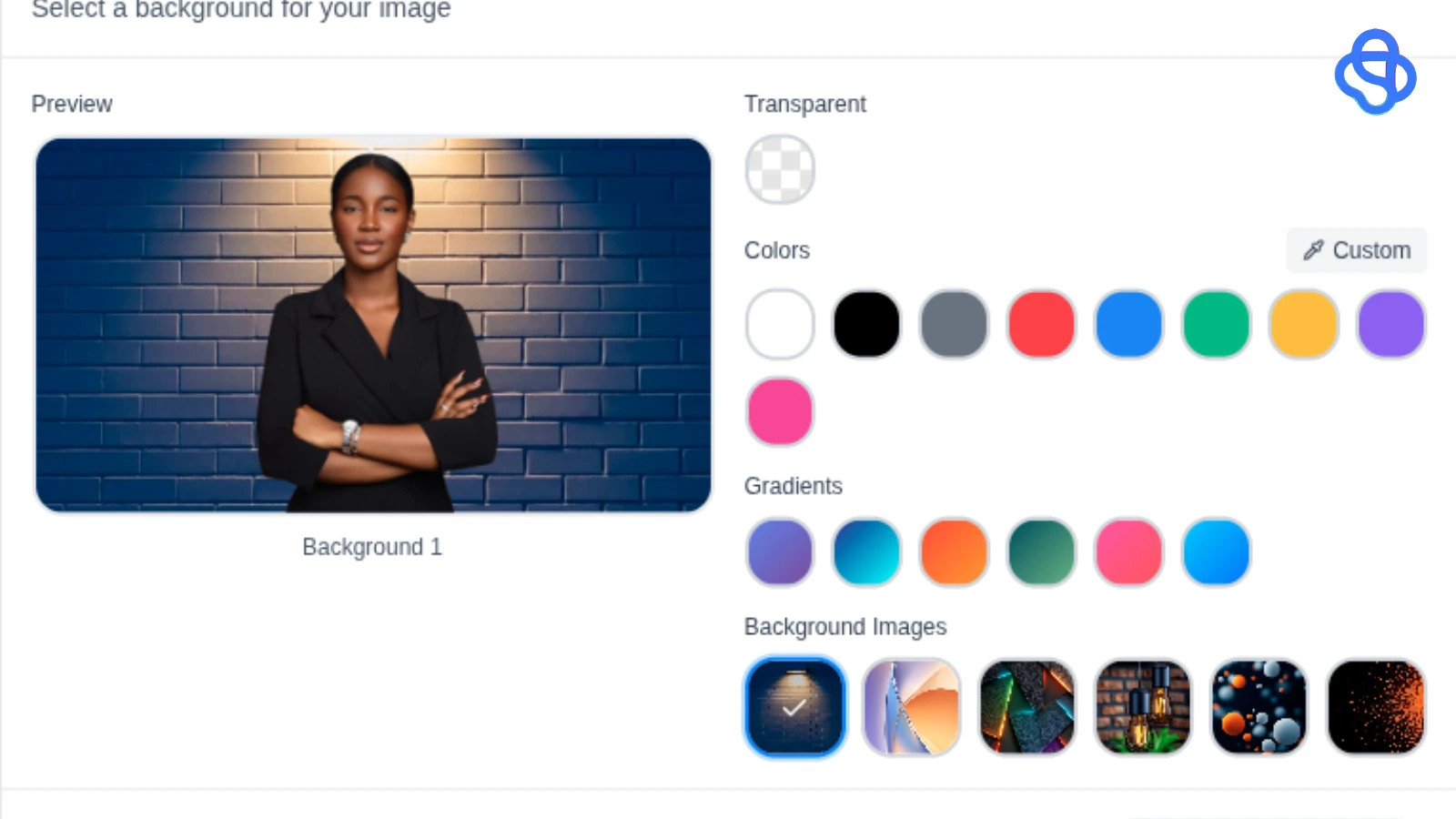
Choose a new background: solid color, gradient, or a saved brand backdrop.
Adjust scale, position, and shadow.
Download the final image for web or ads.
That’s it, no Photoshop skills required. The Composer preserves fine edges and hair, and places the subject naturally on the new background.
Step‑by‑Step: Create Brand Images in Under 3 Minutes
Upload: Click “Upload” and pick an image from your device.
Remove: The background is removed automatically. Use the refine brush only if needed.
Choose: Select a background from your brand palette or upload one. Solid neutrals are great for product detail; tasteful textures work for lifestyle shots.
Tweak: Use scale and position so the product sits well in the frame. Toggle soft shadow for depth.
Export: Download as WebP for small file size or PNG for transparency.
Practical Tips for a Strong, Consistent Look
Pick a main background color: choose one neutral or brand color and use it widely.
Use a small palette: add a secondary and accent background for variety while keeping the same mood.
Save templates: save a few layouts (product, hero, lifestyle) so the whole team uses the same framing.
Keep crop and padding equal: use the same canvas size on category pages.
Add subtle shadows: consistent shadows help images feel real and not “cut out.”
A Simple A/B Test to Measure Impact
Want proof that background consistency helps? Run this test:
Variant A: Current images (control).
Variant B: Images processed with Background Composer (on‑brand backgrounds).
Measure:Click‑through rate on category pages
Add‑to‑cart rate
Conversion rate
If Variant B performs better, you have a strong case to update more images.
SEO & Ad Best Practices
File names: use descriptive names with keywords, e.g.,
red-running-shoe-white-background.webp.Alt text: keep it simple and useful, e.g., “Red running shoe on white background.”
Image size: export WebP when possible for faster pages.
Ads: use Composer images for hero ads and social posts — clean backgrounds often increase CTR.
Real Use Cases
Ecommerce listings — consistent gallery images raise buyer confidence.
Social feeds — a polished, uniform feed increases brand recognition.
Email campaigns — consistent imagery improves click rates.
Marketplaces — better thumbnails can lift clicks and orders.
Before & After — How to Show It
In your blog and product pages, show three clear before/after pairs:
A phone photo with a busy background → product on white background.
Lifestyle shot → on‑brand textured backdrop.
Multiple color variants aligned on same canvas.
Suggested images to include in the post (with alt text)
Hero: Before/after product example — alt: “Before and after background replacement for product photo.”
Step GIF: Upload → Remove → Apply background — alt: “Three-step GIF showing Background Composer workflow.”
Use‑case grid: ecommerce / social / email examples — alt: “Examples of consistent brand imagery across channels.”
Do’s and Don’ts
Do: Use neutral backgrounds when you want product clarity.
Don’t: Use busy patterns for close product shots.
Do: Keep exports consistent (format, size).
Don’t: Over-filter product photos — keep colors true to life.
Try the Background Composer now: upload a single product photo and see the transformation in under a minute. If you run an online store, try the A/B test above on one product and compare results after two weeks.
Closing Thought
Consistent imagery is one of the easiest, highest‑impact ways to make your brand look professional. The Background Composer removes the technical work and makes the process repeatable for any team member. Use it to create trust, clarity, and a stronger brand presence across all your visuals.